Work-in-progress 🚧
You are reading the work-in-progress first edition of Causal Inference in R. This chapter has its foundations written but is still undergoing changes.
You are reading the work-in-progress first edition of Causal Inference in R. This chapter has its foundations written but is still undergoing changes.
Often we are interested in how some exposure (or treatment) impacts an outcome. For example, we could assess how an ad campaign (exposure) impacts sales (outcome), whether a particular medication (exposure) improves patient survival (outcome), or whether opening a theme park early to some visitors (exposure) reduces wait times later in the day (outcome). As defined in the Chapter 3, an exposure in the context of this book is often a modifiable event or condition that occurs before the outcome. In an ideal world, we would simply estimate the correlation between the exposure and outcome as the causal effect of the exposure. Randomized trials are the best practical examples of this idealized scenario: participants are randomly assigned to exposure groups. If all goes well, this allows for an unbiased estimate of the causal effect between the exposure and outcome. In the “real world,” outside this randomized trial setting, we are often exposed to something based on other factors. For example, when deciding what medication to give a diabetic patient, a doctor may consider the patient’s medical history, their likelihood to adhere to certain medications, and the severity of their disease. The treatment is no longer random; it is conditional on factors about that patient, also known as the patient’s covariates. If these covariates also affect the outcome, they are confounders.
A confounder is a common cause of exposure and outcome.
Suppose we could collect information about all of these factors. In that case, we could determine each patient’s probability of exposure and use this to inform an analysis assessing the relationship between that exposure and some outcome. This probability is the propensity score! When used appropriately, modeling with a propensity score can simulate what the relationship between exposure and outcome would have looked like if we had run a randomized trial. The correlation between exposure and outcome will estimate the causal effect after applying a propensity score. When fitting a propensity score model we want to condition on all known confounders.
A propensity score is the probability of being in the exposure group, conditioned on observed covariates.
Rosenbaum and Rubin (1983) showed in observational studies conditioning on propensity scores can lead to unbiased estimates of the exposure effect as long as certain assumptions hold:
There are many ways to estimate the propensity score; typically, people use logistic regression for binary exposures. The logistic regression model predicts the exposure using known confounders. Each individual’s predicted value is the propensity score. The glm() function will fit a logistic regression model in R. Below is pseudo-code. The first argument is the model, with the exposure on the left side and the confounders on the right. The data argument takes the data frame, and the family = binomial() argument denotes the model should be fit using logistic regression (as opposed to a different generalized linear model).
We can extract the propensity scores by pulling out the predictions on the probability scale. Using the augment() function from the {broom} package, we can extract these propensity scores and add them to our original data frame. The argument type.predict is set to "response" to indicate that we want to extract the predicted values on the probability scale. By default, these will be on the linear logit scale. The data argument contains the original data frame; if we leave this blank, we’ll only get back a data frame with the variables in the propensity score model, but we need the outcome, too. This code will output a new data frame consisting of all components in df with six additional columns corresponding to the logistic regression model that was fit. The .fitted column is the propensity score.
Let’s look at an example.
Recall our causal question of interest from Section 7.1: Is there a relationship between whether there were “Extra Magic Hours” in the morning at Magic Kingdom and the average wait time for an attraction called the “Seven Dwarfs Mine Train” the same day between 9am and 10am in 2018? Below is a proposed DAG for this question.
library(tidyverse)
library(ggdag)
library(ggokabeito)

coord_dag <- list(
  x = c(Season = 0, close = 0, weather = -1, x = 1, y = 2),
  y = c(Season = -1, close = 1, weather = 0, x = 0, y = 0)
)

labels <- c(
  x = "Extra Magic Morning",
  y = "Average wait",
  Season = "Ticket Season",
  weather = "Historic high temperature",
  close = "Time park closed"
)

dagify(
  y ~ x + close + Season + weather,
  x ~ weather + close + Season,
  coords = coord_dag,
  labels = labels,
  exposure = "x",
  outcome = "y"
) |>
  tidy_dagitty() |>
  node_status() |>
  ggplot(
    aes(x, y, xend = xend, yend = yend, color = status)
  ) +
  geom_dag_edges_arc(curvature = c(rep(0, 5), .3)) +
  geom_dag_point() +
  geom_dag_label_repel(seed = 1630) +
  scale_color_okabe_ito(na.value = "grey90") +
  theme_dag() +
  theme(
    legend.position = "none",
    axis.text.x = element_text()
  ) +
  coord_cartesian(clip = "off") +
  scale_x_continuous(
    limits = c(-1.25, 2.25),
    breaks = c(-1, 0, 1, 2),
    labels = c(
      "\n(one year ago)",
      "\n(6 months ago)",
      "\n(3 months ago)",
      "9am - 10am\n(Today)"
    )
  )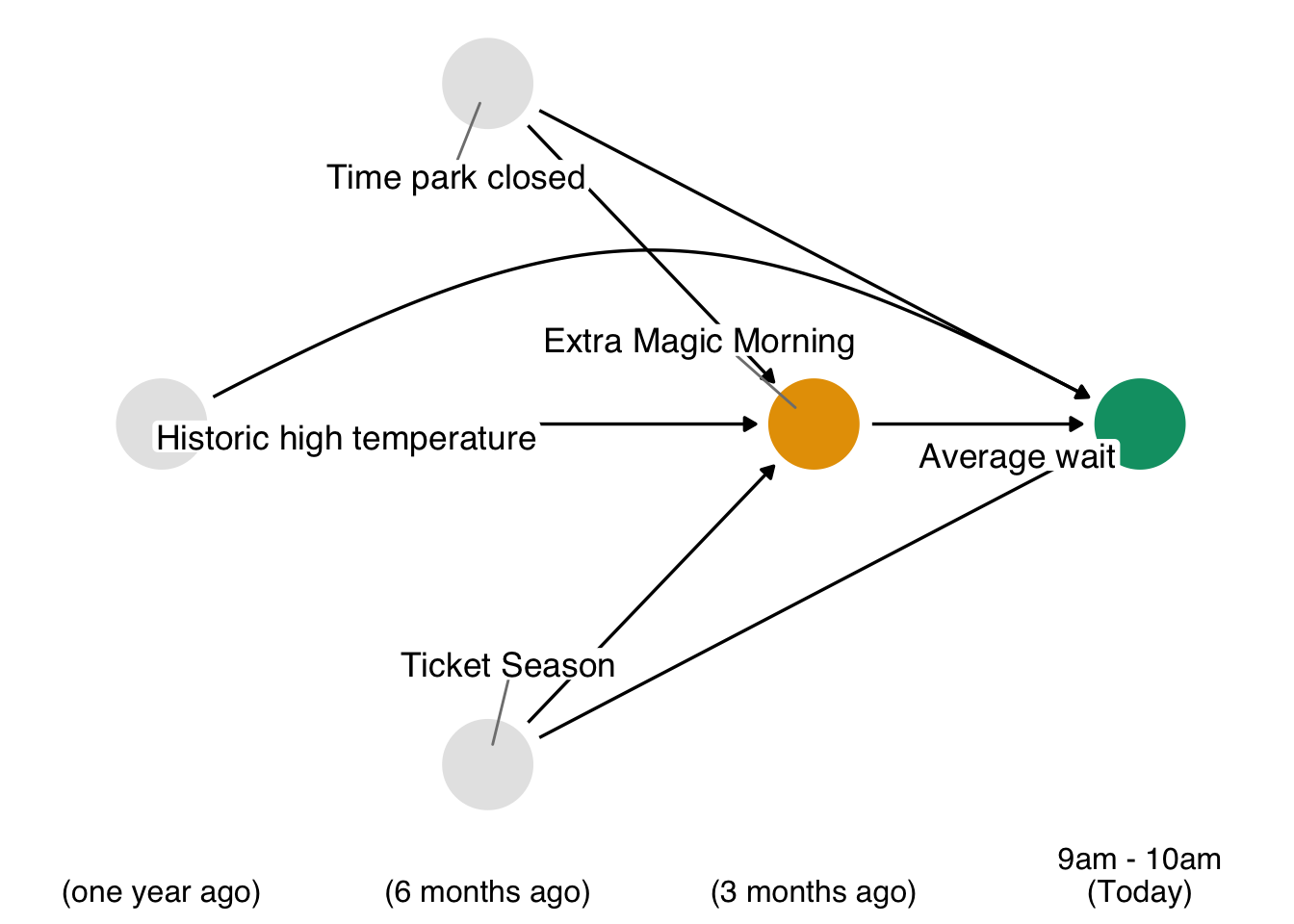
In Figure 8.1, we propose three confounders: the historic high temperature on the day, the time the park closed, and the ticket season: value, regular, or peak. We can build a propensity score model using the seven_dwarfs_train_2018 data set from the touringplans package. Each row of this dataset contains information about the Seven Dwarfs Mine Train during a particular hour on a given day. First, we need to subset the data to only include average wait times between 9 and 10 am. Then we will use the glm() function to fit the propensity score model, predicting park_extra_magic_morning using the four confounders specified above. We’ll add the propensity scores to the data frame (in a column called .fitted as set by the augment() function in the broom package).
library(broom)
library(touringplans)

seven_dwarfs_9 <- seven_dwarfs_train_2018 |> filter(wait_hour == 9)

seven_dwarfs_9_with_ps <-
  glm(
    park_extra_magic_morning ~ park_ticket_season + park_close + park_temperature_high,
    data = seven_dwarfs_9,
    family = binomial()
  ) |>
  augment(type.predict = "response", data = seven_dwarfs_9)
Let’s take a look at these propensity scores. Table 8.1 shows the propensity scores (in the .fitted column) for the first six days in the dataset, as well as the values of each day’s exposure, outcome, and confounders. The propensity score here is the probability that a given date will have Extra Magic Hours in the morning given the observed confounders, in this case, the historical high temperatures on a given date, the time the park closed, and Ticket Season. For example, on January 1, 2018, there was a 30.2% chance that there would be Extra Magic Hours at the Magic Kingdom given the Ticket Season (peak in this case), time of park closure (11 pm), and the historic high temperature on this date (58.6 degrees). On this particular day, there were not Extra Magic Hours in the morning (as indicated by the 0 in the first row of the park_extra_magic_morning column).
seven_dwarfs_9_with_ps |>
  select(
    .fitted,
    park_date,
    park_extra_magic_morning,
    park_ticket_season,
    park_close,
    park_temperature_high
  ) |>
  head() |>
knitr::kable()| .fitted | park_date | park_extra_magic_morning | park_ticket_season | park_close | park_temperature_high |
|---|---|---|---|---|---|
| 0.3019 | 2018-01-01 | 0 | peak | 23:00:00 | 58.63 |
| 0.2815 | 2018-01-02 | 0 | peak | 24:00:00 | 53.65 |
| 0.2900 | 2018-01-03 | 0 | peak | 24:00:00 | 51.11 |
| 0.1881 | 2018-01-04 | 0 | regular | 24:00:00 | 52.66 |
| 0.1841 | 2018-01-05 | 1 | regular | 24:00:00 | 54.29 |
| 0.2074 | 2018-01-06 | 0 | regular | 23:00:00 | 56.25 |
seven_dwarfs_9_with_ps dataset, including their propensity scores in the .fitted column.
We can examine the distribution of propensity scores by exposure group. A nice way to visualize this is via mirrored histograms. We’ll use the {halfmoon} package’s geom_mirror_histogram() to create one. The code below creates two histograms of the propensity scores, one on the “top” for the exposed group (the dates with Extra Magic Hours in the morning) and one on the “bottom” for the unexposed group. We’ll also tweak the y-axis labels to use absolute values (rather than negative values for the bottom histogram) via scale_y_continuous(labels = abs).
library(halfmoon)
ggplot(
  seven_dwarfs_9_with_ps,
  aes(.fitted, fill = factor(park_extra_magic_morning))
) +
  geom_mirror_histogram(bins = 50) +
  scale_y_continuous(labels = abs) +
  labs(x = "propensity score", fill = "extra magic morning")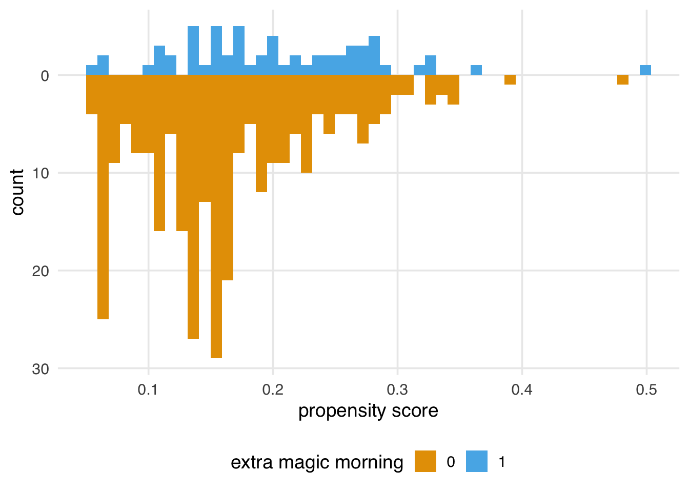
Here are some questions to ask to gain diagnostic insights we gain from Figure 8.2.
Look for lack of overlap as a potential positivity problem. But too much overlap may indicate a poor model
Avg treatment effect among treated is easier to estimate with precision (because of higher counts) than in the control group.
A single outlier in either group concerning range could be a problem and warrant data inspection
The best way to decide what variables to include in your propensity score model is to look at your DAG and have at least a minimal adjustment set of confounders. Of course, sometimes, essential variables are missing or measured with error. In addition, there is often more than one theoretical adjustment set that debiases your estimate; it may be that one of the minimal adjustment sets is measured well in your data set and another is not. If you have confounders on your DAG that you do not have access to, sensitivity analyses can help quantify the potential impact. See Chapter 11 for an in-depth discussion of sensitivity analyses.
Accurately specifying a DAG improves our ability to add the correct variables to our models. However, confounders are not the only necessary type of variable to consider. For example, variables that are predictors of the outcome but not the exposure can improve the precision of propensity score models. Conversely, including variables that are predictors of the exposure but not the outcome (instrumental variables) can bias the model. Luckily, this bias seems relatively negligible in practice, especially compared to the risk of confounding bias (Myers et al. 2011).
Some estimates, such as the odds and hazard ratios, have a property called non-collapsibility. This means that marginal odds and hazard ratios are not weighted averages of their conditional versions. In other words, the results might differ depending on the variable added or removed, even when the variable is not a confounder. We’ll explore this more in Section 10.4.2.
Another variable to be wary of is a collider, a descendant of both the exposure and outcome. If you specify your DAG correctly, you can avoid colliders by only using adjustment sets that completely close backdoor paths from the exposure to the outcome. However, some circumstances make this difficult: some colliders are inherently stratified by the study’s design or the nature of follow-up. For example, loss-to-follow-up is a common source of collider-stratification bias; in Chapter XX, we’ll discuss this further.
A variable can also be both a confounder and a collider, as in the case of so-called butterfly bias:
ggdag(butterfly_bias()) +
  theme_dag()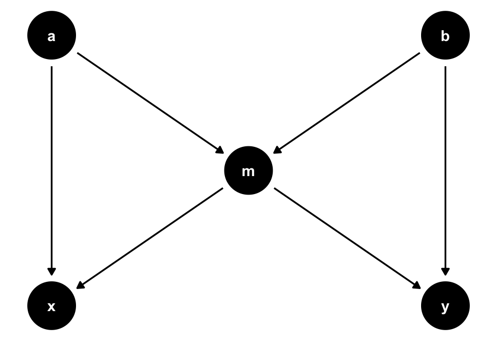
m, which is both a collider and a confounder for x and y. In situations where you don’t have all measured variables in a DAG, you may have to make a tough choice about which type of bias is the least bad.
Consider Figure 8.3. To estimate the causal effect of x on y, we need to account for m because it’s a counfounder. However, m is also a collider between a and b, so controlling for it will induce a relationship between those variables, creating a second set of confounders. If we have all the variables measured well, we can avoid the bias from adjusting for m by adjusting for either a or b as well.
ggdag_adjustment_set(butterfly_bias()) +
  theme_dag() +
  theme(legend.position = "bottom")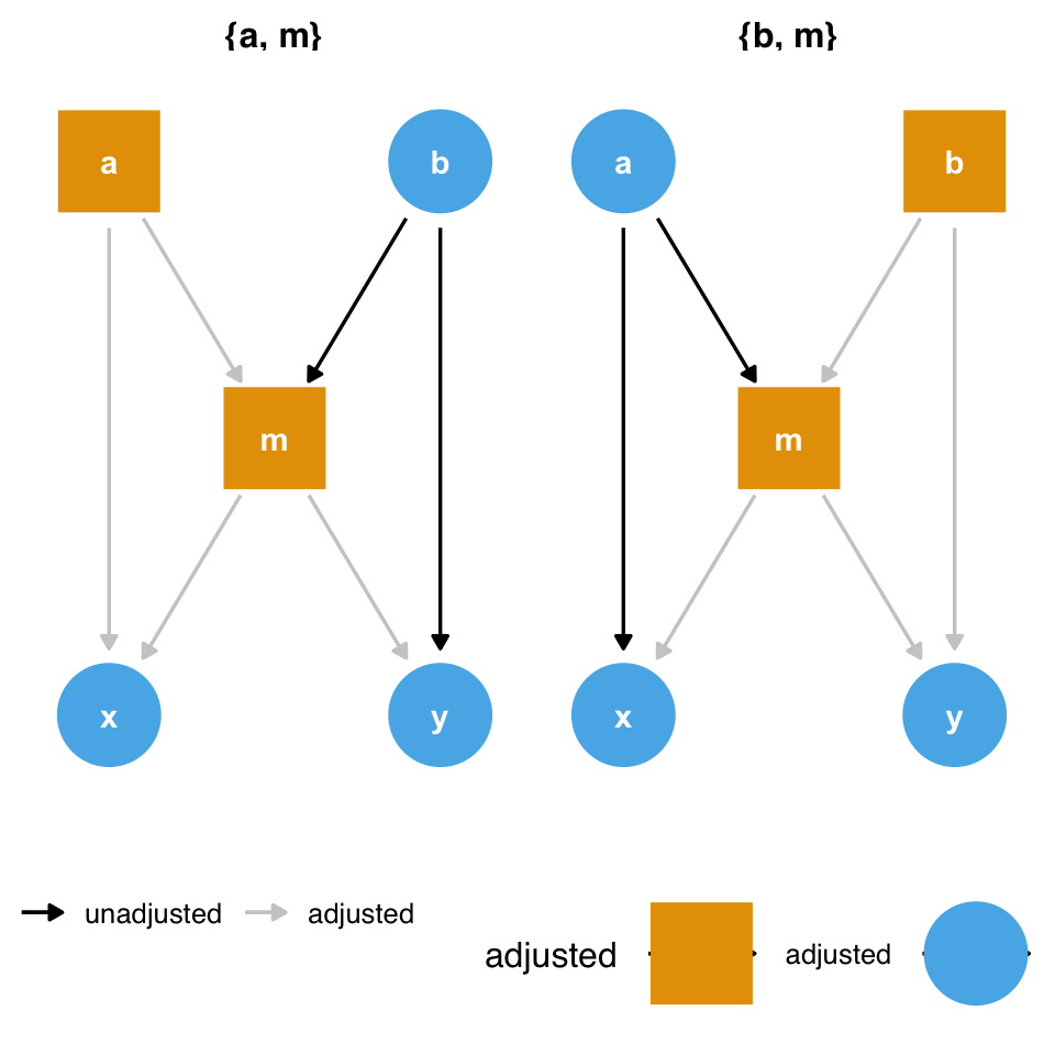
m and the collider bias induced by adjusting for it. But what if we don’t have a or b?
However, what should we do if we don’t have those variables? Adjusting for m opens a biasing pathway that we cannot block through a and b(collider-stratification bias), but m is also a confounder for x and y. As in the case above, it appears that confounding bias is often the worse of the two options, so we should adjust for m unless we have reason to believe it will cause more problems than it solves (Ding and Miratrix 2015).
By and large, metrics commonly used for building prediction models are inappropriate for building causal models. Researchers and data scientists often make decisions about models using metrics like R2, AUC, accuracy, and (often inappropriately) p-values. However, a causal model’s goal is not to predict as much about the outcome as possible (Hernán and Robins 2021); the goal is to estimate the relationship between the exposure and outcome accurately. A causal model needn’t predict particularly well to be unbiased.
These metrics, however, may help identify a model’s best functional form. Generally, we’ll use DAGs and our domain knowledge to build the model itself. However, we may be unsure of the mathematical relationship between a confounder and the outcome or exposure. For instance, we may not know if the relationship is linear. Misspecifying this relationship can lead to residual confounding: we may only partially account for the confounder in question, leaving some bias in the estimate. Testing different functional forms using prediction-focused metrics can help improve the model’s accuracy, potentially allowing for better control.
Another technique researchers sometimes use to determine confounders is to add a variable, then calculate the percent change in the coefficient between the outcome and exposure. For instance, we first model y ~ x to estimate the relationship between x and y. Then, we model y ~ x + z and see how much the coefficient on x has changed. A common rule is to add a variable if it changes the coefficient ofx by 10%.
Unfortunately, this technique is unreliable. As we’ve discussed, controlling for mediators, colliders, and instrumental variables all affect the estimate of the relationship between x and y, and usually, they result in bias. Additionally, the non-collapsibility of the odds and hazards ratios mean they may change with the addition or subtraction of a variable without representing an improvement or worsening in bias. In other words, there are many different types of variables besides confounders that can cause a change in the coefficient of the exposure. As discussed above, confounding bias is often the most crucial factor, but systematically searching your variables for anything that changes the exposure coefficient can compound many types of bias.
In predictive modeling, data scientists often have to prevent overfitting their models to chance patterns in the data. When a model captures those chance patterns, it doesn’t predict as well on other data sets. So, can you overfit a causal model?
The short answer is yes, although it’s easier to do it with machine learning techniques than with logistic regression and friends. An overfit model is, essentially, a misspecified model (Gelman 2017). A misspecified model will lead to residual confounding and, thus, a biased causal effect. Overfitting can also exacerbate stochastic positivity violations (Zivich, Cole, and Westreich 2022). The correct causal model (the functional form that matches the data-generating mechanism) cannot be overfit. The same is true for the correct predictive model.
There’s some nuance to this answer, though. Overfitting in causal inference and prediction is different; we’re not applying the causal estimate to another dataset (the closest to that is transportability and generalizability, an issue we’ll discuss in Chapter 24). It remains true that a causal model doesn’t need to predict particularly well to be unbiased.
In prediction modeling, people often use a bias-variance trade-off to improve out-of-data predictions. In short, some bias for the sample is introduced to improve the variance of model fits and make better predictions out of the sample. However, we must be careful: the word bias here refers to the discrepancy between the model estimates and the true value of the dependent variable in the dataset. Let’s call this statistical bias. It is not necessarily the same as the difference between the model estimate and the true causal effect in the population. Let’s call this causal bias. If we apply the bias-variance trade-off to causal models, we introduce statistical bias in an attempt to reduce causal bias. Another subtlety is that overfitting can inflate the standard error of the estimate in the sample, which is not the same variance as the bias-variance trade-off (Schuster, Lowe, and Platt 2016). From a frequentist standpoint, the confidence intervals will also not have nominal coverage (see Appendix A) because of the causal bias in the estimate.
In practice, cross-validation, a technique to reduce overfitting, is often used with causal models that use machine learning, as we’ll discuss in Chapter 21.
The propensity score is a balancing tool – we use it to help us make our exposure groups exchangeable. There are many ways to incorporate the propensity score into an analysis. Commonly used techniques include stratification (estimating the causal effect within propensity score stratum), matching, weighting, and direct covariate adjustment. In this section, we will focus on matching and weighting; other techniques will be discussed once we introduce the outcome model. Recall at this point in the book we are still in the design phase. We have not yet incorporated the outcome into our analysis at all.
Ultimately, we want the exposed and unexposed observations to be exchangeable with respect to the confounders we have proposed in our DAG (so we can use the observed effect for one to estimate the counterfactual for the other). One way to do this is to ensure that each observation in our analysis sample has at least one observation of the opposite exposure that has matching values for each of these confounders. If we had a small number of binary confounders, for example, we might be able to construct an exact match for observations (and only include those for whom such a match exists), but as the number and continuity of confounders increases, exact matching becomes less feasible. This is where the propensity score, a summary measure of all of the confounders, comes in to play.
Let’s setup the data as we did in Section 8.1.
library(broom)
library(touringplans)

seven_dwarfs_9 <- seven_dwarfs_train_2018 |> filter(wait_hour == 9)
We can re-fit the propensity score using the MatchIt package, as below. Notice here the matchit function fit a logistic regression model for our propensity score, as we had in Section 8.1. There were 60 days in 2018 where the Magic Kingdom had extra magic morning hours. For each of these 60 exposed days, matchit found a comparable unexposed day, by implementing a nearest-neighbor match using the constructed propensity score. Examining the output, we also see that the target estimand is an “ATT” (do not worry about this yet, we will discuss this and several other estimands in Chapter 10).
library(MatchIt)
m <- matchit(
  park_extra_magic_morning ~ park_ticket_season + park_close + park_temperature_high,
  data = seven_dwarfs_9
)
m
A `matchit` object
- method: 1:1 nearest neighbor matching without replacement
- distance: Propensity score
- estimated with logistic regression
- number of obs.: 354 (original), 120 (matched)
- target estimand: ATT
- covariates: park_ticket_season, park_close, park_temperature_highWe can use the get_matches function to create a data frame with the original variables that only consists of those who were matched. Notice here our sample size has been reduced from the original 354 days to 120.
matched_data <- get_matches(m)
glimpse(matched_data)
Rows: 120
Columns: 18
$ id <chr> "5", "340", "12", "1…
$ subclass <fct> 1, 1, 2, 2, 3, 3, 4,…
$ weights <dbl> 1, 1, 1, 1, 1, 1, 1,…
$ park_date <date> 2018-01-05, 2018-12…
$ wait_hour <int> 9, 9, 9, 9, 9, 9, 9,…
$ attraction_name <chr> "Seven Dwarfs Mine T…
$ wait_minutes_actual_avg <dbl> 33.0, 8.0, 114.0, 32…
$ wait_minutes_posted_avg <dbl> 70.56, 80.62, 79.29,…
$ attraction_park <chr> "Magic Kingdom", "Ma…
$ attraction_land <chr> "Fantasyland", "Fant…
$ park_open <time> 09:00:00, 09:00:00,…
$ park_close <time> 24:00:00, 23:00:00,…
$ park_extra_magic_morning <dbl> 1, 0, 1, 0, 1, 0, 1,…
$ park_extra_magic_evening <dbl> 0, 0, 0, 0, 0, 0, 0,…
$ park_ticket_season <chr> "regular", "regular"…
$ park_temperature_average <dbl> 43.56, 57.61, 70.91,…
$ park_temperature_high <dbl> 54.29, 65.44, 78.26,…
$ distance <dbl> 0.18410, 0.18381, 0.…One way to think about matching is as a crude “weight” where everyone who was matched gets a weight of 1 and everyone who was not matched gets a weight of 0 in the final sample. Another option is to allow this weight to be smooth, applying a weight to allow, on average, the covariates of interest to be balanced in the weighted population. To do this, we will construct a weight using the propensity score. There are many different weights that can be applied, depending on your target estimand of interest (see Chapter 10 for details). For this section, we will focus on the “Average Treatment Effect” weights, commonly referred to as an “inverse probability weight”. The weight is constructed as follows, where each observation is weighted by the inverse of the probability of receiving the exposure they received.
\[w_{ATE} = \frac{X}{p} + \frac{(1 - X)}{1 - p}\]
For example, if observation 1 had a very high likelihood of being exposed given their pre-exposure covariates (\(p = 0.9\)), but they in fact were not exposed, their weight would be 10 (\(w_1 = 1 / (1 - 0.9)\)). Likewise, if observation 2 had a very high likelihood of being exposed given their pre-exposure covariates (\(p = 0.9\)), and they were exposed, their weight would be 1.1 (\(w_2 = 1 / 0.9\)). Intuitively, we give more weight to observations who, based on their measured confounders, appear to have useful information for constructing a counterfactual – we would have predicted that they were exposed and but by chance they were not, or vice-versa. The propensity package is useful for implementing propensity score weighting.
library(propensity)

seven_dwarfs_9_with_ps <-
  glm(
    park_extra_magic_morning ~ park_ticket_season + park_close + park_temperature_high,
    data = seven_dwarfs_9,
    family = binomial()
  ) |>
  augment(type.predict = "response", data = seven_dwarfs_9)
seven_dwarfs_9_with_wt <- seven_dwarfs_9_with_ps |>
  mutate(w_ate = wt_ate(.fitted, park_extra_magic_morning))
Table 8.2 shows the weights in the first column.
seven_dwarfs_9_with_wt |>
  select(
    w_ate,
    .fitted,
    park_date,
    park_extra_magic_morning,
    park_ticket_season,
    park_close,
    park_temperature_high
  ) |>
  head() |>
knitr::kable()| w_ate | .fitted | park_date | park_extra_magic_morning | park_ticket_season | park_close | park_temperature_high |
|---|---|---|---|---|---|---|
| 1.433 | 0.3019 | 2018-01-01 | 0 | peak | 23:00:00 | 58.63 |
| 1.392 | 0.2815 | 2018-01-02 | 0 | peak | 24:00:00 | 53.65 |
| 1.408 | 0.2900 | 2018-01-03 | 0 | peak | 24:00:00 | 51.11 |
| 1.232 | 0.1881 | 2018-01-04 | 0 | regular | 24:00:00 | 52.66 |
| 5.432 | 0.1841 | 2018-01-05 | 1 | regular | 24:00:00 | 54.29 |
| 1.262 | 0.2074 | 2018-01-06 | 0 | regular | 23:00:00 | 56.25 |
seven_dwarfs_9_with_wt dataset, including their propensity scores in the .fitted column and weight in the w_ate column.