You are reading the work-in-progress first edition of Causal Inference in R. This chapter has its foundations written but is still undergoing changes.
10 Causal estimands
10.1 Estimands, Estimators, Estimates
When analyzing to make causal inferences, we need to keep the causal question that we’re interested in close to our chest. The causal question helps guide not just the assumptions we need to make but also how we will go about answering the question. This chapter deals with three ideas closely related to answering causal questions: the estimand, the estimator, and the estimate. The estimand is the target of interest, the estimator is the method by which we approximate this estimand using data, and the estimate is the value we get when we plug our data into the estimator. You can think of the estimand as a glossy picture of a beautiful cake we are trying to bake, the estimator as the recipe, and the estimate as the cake we pull out of our oven.
So far, we have been estimating the average treatment effect, the effect of the exposure of interest averaged across the whole population. The estimand here is the expected value of the difference in potential outcomes across all individuals:
\[E[Y(1) - Y(0)]\]
The estimator we use depends on the method we’ve chosen. For example, in an A/B test or randomized controlled trial, our estimator could just be the average outcome among those who received the exposure A minus the average outcome among those who receive exposure B.
\[\sum_{i=1}^{N}\frac{Y_i\times X_i}{N_{\textrm{A}}} - \frac{Y_i\times (1-X_i)}{N_{\textrm{B}}}\]
Where \(X\) is just an indicator for exposure A (\(X = 1\) for exposure A and \(X = 0\) for exposure B), \(N_A\) is the total number in group A and \(N_B\) is the total number in group B such that \(N_A + N_B = N\). Let’s motivate this example a bit more. Suppose we have two different designs for a call-to-action (often abbreviated as CTA, a written directive for a marketing campaign) and want to assess whether they lead to a different average number of items a user purchases. We can create an A/B test where we randomly assign a subset of users to see design A or design B. Suppose we have A/B testing data for 100 participants in a dataset called ab. Here is some code to simulate such a data set.
library(tidyverse)
set.seed(928)
ab <- tibble(
  # generate the exposure, x, from a binomial distribution
  # with the probability exposure A of 0.5
  x = rbinom(100, 1, 0.5),
  # generate the "true" average treatment effect of 1
  # we use rnorm(100) to add the random error term that is normally
  # distributed with a mean of 0 and a standard deviation of 1
  y = x + rnorm(100)
)
Here the exposure is x, and the outcome is y. The true average treatment effect is 1, implying that on average seeing call-to-action A increases the number of items purchased by 1.
ab# A tibble: 100 × 2
x y
<int> <dbl>
1 0 -0.280
2 1 1.87
3 1 1.36
4 0 -0.208
5 0 1.13
6 1 0.352
7 1 -0.148
8 1 2.08
9 0 2.09
10 0 -1.41
# ℹ 90 more rowsBelow are two ways to estimate this in R. Using a formula approach, we calculate the difference in y between exposure values in the first example.
ab |>
  summarize(
    n_a = sum(x),
    n_b = sum(1 - x),
    estimate = sum(
      (y * x) / n_a -
        y * (1 - x) / n_b
    )
  )
# A tibble: 1 × 3
n_a n_b estimate
<int> <dbl> <dbl>
1 54 46 1.15Alternatively, we can group_by() x and summarize() the means of y for each group, then pivot the results to take their difference.
ab |>
  group_by(x) |>
  summarize(avg_y = mean(y)) |>
  pivot_wider(
    names_from = x,
    values_from = avg_y,
    names_prefix = "x_"
  ) |>
  summarize(estimate = x_1 - x_0)
# A tibble: 1 × 1
estimate
<dbl>
1 1.15Because \(X\), the exposure, was randomly assigned, this estimator results in an unbiased estimate of our estimand of interest.
What do we mean by unbiased, though? Notice that while the “true” causal effect is 1, this estimate is not precisely 1; it is 1.149. Why the difference? This A/B test included a sample of 100 participants, not the whole population. As that sample increases, our estimate will get closer to the truth. Let’s try that. Let’s simulate the data again but increase the sample size from 100 to 100,000:
set.seed(928)
ab <- tibble(
  x = rbinom(100000, 1, 0.5),
  y = x + rnorm(100000)
)

ab |>
  summarize(
    n_a = sum(x),
    n_b = sum(1 - x),
    estimate = sum(
      (y * x) / n_a -
        y * (1 - x) / n_b
    )
  )
# A tibble: 1 × 3
n_a n_b estimate
<int> <dbl> <dbl>
1 49918 50082 1.01Notice how the estimate is 1.01, much closer to the actual average treatment effect, 1.
Suppose \(X\) had not been randomly assigned. In that case, we could use the pre-exposure covariates to estimate the conditional probability of \(X\) (the propensity score) and incorporate this probability in a weight \((w_i)\) to estimate this causal effect. For example, we could use the following estimator to estimate our average treatment effect estimand:
\[\frac{\sum_{i=1}^NY_i\times X_i\times w_i}{\sum_{i=1}^NX_i\times w_i}-\frac{\sum_{i=1}^NY_i\times(1-X_i)\times w_i}{\sum_{i=1}^N(1-X_i)\times w_i}\]
10.2 Estimating treatment effects with specific targets in mind
Depending on the study’s goal, or the causal question, we may want to estimate different estimands. Here, we will outline the most common causal estimands, their target populations, the causal questions they may help answer, and the methods used to estimate them (Greifer and Stuart 2021).
10.2.1 Average treatment effect
A common estimand is the average treatment effect (ATE). The target population is the total sample or population of interest. The estimand here is the expected value of the difference in potential outcomes across all individuals:
\[E[Y(1) - Y(0)]\]
An example research question is “Should a policy be applied to all eligible patients?” (Greifer and Stuart 2021).
Most randomized controlled trials are designed with the ATE as the target estimand. In a non-randomized setting, you can estimate the ATE using full matching. Each observation in the exposed group is matched to at least one observation in the control group (and vice versa) without replacement. Alternatively, the following inverse probability weight will allow you to estimate the ATE using propensity score weighting.
\[w_{ATE} = \frac{X}{p} + \frac{(1 - X)}{1 - p}\]
In other words, the weight is one over the propensity score for those in the exposure group and one over one minus the propensity score for the control group. Intuitively, this weight equates to the inverse probability of being in the exposure group in which you actually were.
Let’s dig deeper into this causal estimand using the Touring Plans data. Recall that in Section 8.4, we examined the relationship between whether there were “Extra Magic Hours” in the morning and the average wait time for the Seven Dwarfs Mine Train the same day between 9 am and 10 am. Let’s reconstruct our data set, seven_dwarfs and fit the same propensity score model specified previously.
library(broom)
library(touringplans)

seven_dwarfs <- seven_dwarfs_train_2018 |>
  filter(wait_hour == 9) |>
  mutate(park_extra_magic_morning = factor(
    park_extra_magic_morning,
    labels = c("No Magic Hours", "Extra Magic Hours")
  ))

seven_dwarfs_with_ps <- glm(
  park_extra_magic_morning ~ park_ticket_season + park_close + park_temperature_high,
  data = seven_dwarfs,
  family = binomial()
) |>
  augment(type.predict = "response", data = seven_dwarfs)
Let’s examine a table of the variables of interest in this data frame. To do so, we are going to use the tbl_summary() function from the gtsummary package. (We’ll also use the labelled package to clean up the variable names for the table.)
library(gtsummary)
library(labelled)
seven_dwarfs_with_ps <- seven_dwarfs_with_ps |>
  set_variable_labels(
    park_ticket_season = "Ticket Season",
    park_close = "Close Time",
    park_temperature_high = "Historic High Temperature"
  )

tbl_summary(
  seven_dwarfs_with_ps,
  by = park_extra_magic_morning,
  include = c(park_ticket_season, park_close, park_temperature_high)
) |>
  # add an overall column to the table
add_overall(last = TRUE)| Characteristic |
No Magic Hours N = 2941 |
Extra Magic Hours N = 601 |
Overall N = 3541 |
|---|---|---|---|
| Ticket Season | |||
| peak | 60 (20%) | 18 (30%) | 78 (22%) |
| regular | 158 (54%) | 35 (58%) | 193 (55%) |
| value | 76 (26%) | 7 (12%) | 83 (23%) |
| Close Time | |||
| 16:30:00 | 1 (0.3%) | 0 (0%) | 1 (0.3%) |
| 18:00:00 | 37 (13%) | 18 (30%) | 55 (16%) |
| 20:00:00 | 18 (6.1%) | 2 (3.3%) | 20 (5.6%) |
| 21:00:00 | 28 (9.5%) | 0 (0%) | 28 (7.9%) |
| 22:00:00 | 91 (31%) | 11 (18%) | 102 (29%) |
| 23:00:00 | 78 (27%) | 11 (18%) | 89 (25%) |
| 24:00:00 | 40 (14%) | 17 (28%) | 57 (16%) |
| 25:00:00 | 1 (0.3%) | 1 (1.7%) | 2 (0.6%) |
| Historic High Temperature | 84 (78, 89) | 83 (76, 87) | 84 (78, 89) |
| 1 n (%); Median (Q1, Q3) | |||
From Table 10.1, 294 days did not have extra magic hours in the morning, and 60 did. We also see that 30% of the extra magic mornings were during peak season compared to 20% of the non-extra magic mornings. Additionally, days with extra magic mornings were more likely to close at 6 pm (18:00:00) compared to non-magic hour mornings. The median high temperature on days with extra magic hour mornings is slightly lower (83 degrees) compared to non-extra magic hour morning days.
Now let’s construct our propensity score weight to estimate the ATE. The propensity package has helper functions to estimate weights. The wt_ate() function will calculate ATE weights.
library(propensity)
seven_dwarfs_wts <- seven_dwarfs_with_ps |>
  mutate(w_ate = wt_ate(.fitted, park_extra_magic_morning))
Let’s look at a distribution of these weights.
ggplot(seven_dwarfs_wts, aes(x = w_ate)) +
  geom_histogram(bins = 50)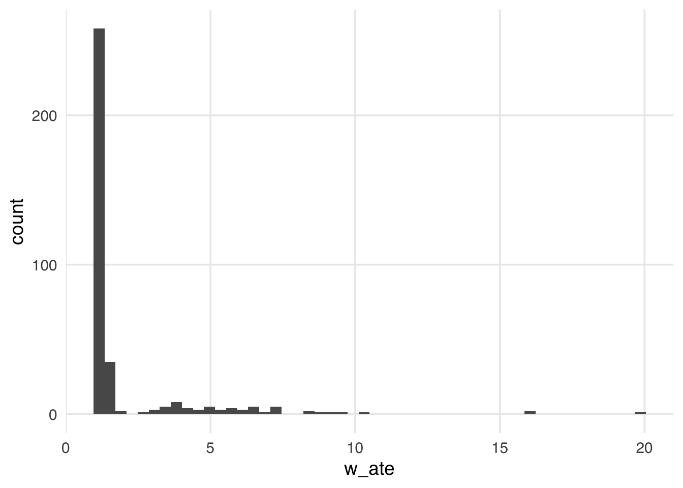
Many weights in Figure 10.1 are close to 1 (the smallest possible value for an ATE weight), with a long tail leading to the largest weight (around 24). This distribution highlights a potential problem with ATE weights. They range from 1 to infinity; if your weights are too large in small samples, this can lead to bias in your estimates (known as finite sample bias).
We know that not accounting for confounders can bias our causal estimates, but it turns out that even after accounting for all confounders, we may still get a biased estimate in finite samples. Many of the properties we tout in statistics rely on large samples—how “large” is defined can be opaque. Let’s look at a quick simulation. Here, we have an exposure, \(X\), an outcome, \(Y\), and one confounder, \(Z\). We will simulate \(Y\), which is only dependent on \(Z\) (so the true treatment effect is 0), and \(X\), which also depends on \(Z\).
set.seed(928)
n <- 100
finite_sample <- tibble(
  # z is normally distributed with a mean: 0 and sd: 1
  z = rnorm(n),
  # x is defined from a probit selection model with normally distributed errors
  x = case_when(
    0.5 + z + rnorm(n) > 0 ~ 1,
    TRUE ~ 0
  ),
  # y is continuous, dependent only on z with normally distrbuted errors
  y = z + rnorm(n)
)
If we fit a propensity score model using the one confounder \(Z\) and calculate the weighted estimator, we should get an unbiased result (which in this case would be 0).
## fit the propensity score model
finite_sample_wts <- glm(
  x ~ z,
  data = finite_sample,
  family = binomial("probit")
) |>
  augment(data = finite_sample, type.predict = "response") |>
  mutate(wts = wt_ate(.fitted, x))

finite_sample_wts |>
  summarize(
    effect = sum(y * x * wts) / sum(x * wts) -
      sum(y * (1 - x) * wts) / sum((1 - x) * wts)
  )
# A tibble: 1 × 1
effect
<dbl>
1 0.197Ok, here, our effect of \(X\) is pretty far from 0, although it’s hard to know if this is really bias, or something we are just seeing by chance in this particular simulated sample. To explore the potential for finite sample bias, we can rerun this simulation many times at different sample sizes. Let’s do that.
sim <- function(n) {
  ## create a simulated dataset
  finite_sample <- tibble(
    z = rnorm(n),
    x = case_when(
      0.5 + z + rnorm(n) > 0 ~ 1,
      TRUE ~ 0
    ),
    y = z + rnorm(n)
  )
  finite_sample_wts <- glm(
    x ~ z,
    data = finite_sample,
    family = binomial("probit")
  ) |>
    augment(data = finite_sample, type.predict = "response") |>
    mutate(wts = wt_ate(.fitted, x))
  bias <- finite_sample_wts |>
    summarize(
      effect = sum(y * x * wts) / sum(x * wts) -
        sum(y * (1 - x) * wts) / sum((1 - x) * wts)
    ) |>
    pull()
  tibble(
    n = n,
    bias = bias
  )
}

## Examine 5 different sample sizes, simulate each 1000 times
set.seed(1)
finite_sample_sims <- map_df(
  rep(
    c(50, 100, 500, 1000, 5000, 10000),
    each = 1000
  ),
  sim
)

bias <- finite_sample_sims |>
  group_by(n) |>
  summarize(bias = mean(bias))
Let’s plot our results:
ggplot(bias, aes(x = n, y = bias)) +
  geom_point() +
  geom_line() +
  geom_hline(yintercept = 0, lty = 2)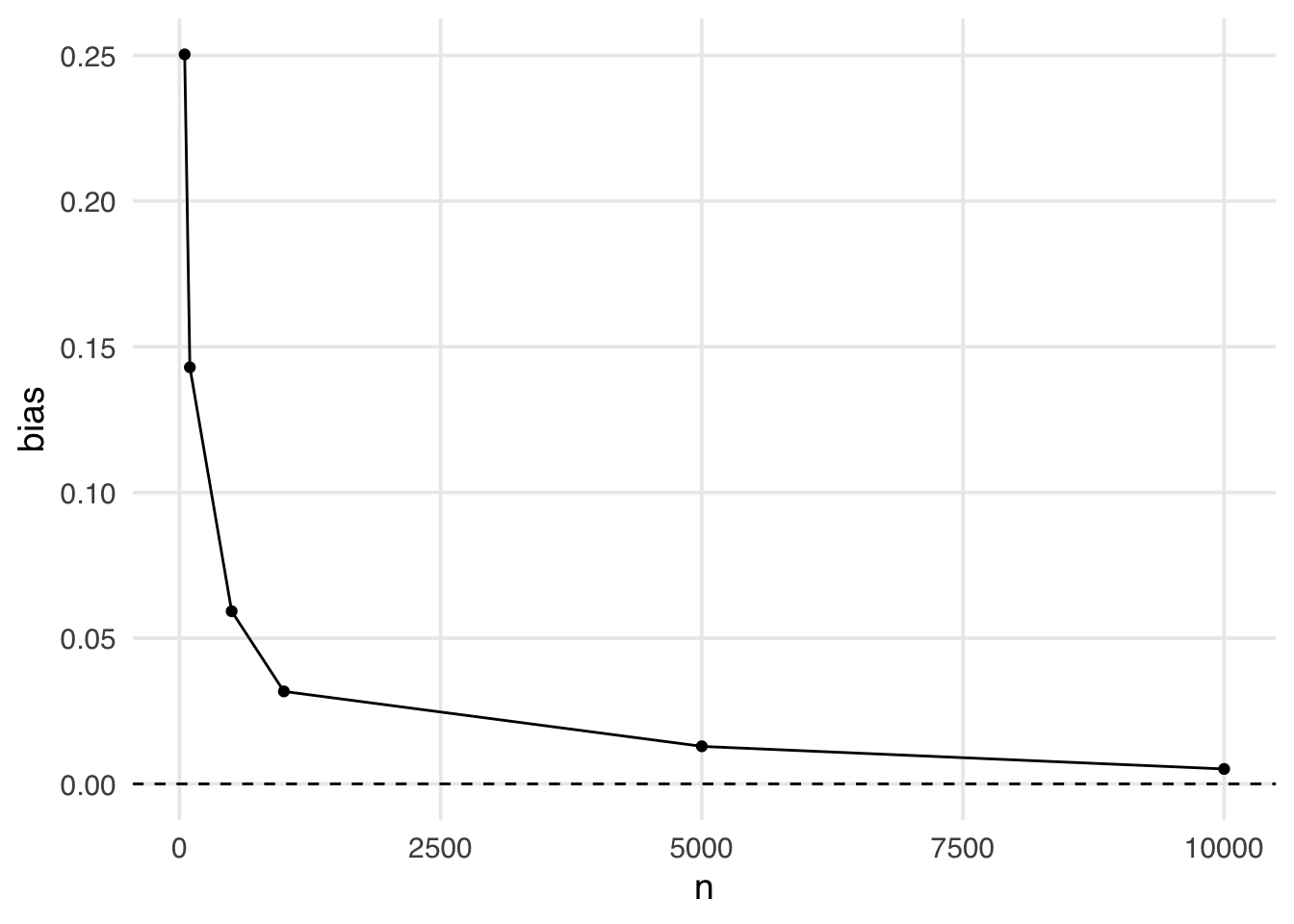
This is an example of finite sample bias. Notice here, even when the sample size is quite large (5,000) we still see some bias away from the “true” effect of 0. It isn’t until a sample size larger than 10,000 that we see this bias disappear.
Estimands that utilize weights that are unbounded (i.e. that theoretically can be infinitely large) are more likely to suffer from finite sample bias. The likelihood of falling into finite sample bias depends on:
(1) the estimand you have chosen (i.e. are the weights bounded?)
(2) the distribution of the covariates in the exposed and unexposed groups (i.e. is there good overlap? Potential positivity violations, when there is poor overlap, are the regions where weights can become too large)
(3) the sample size.
The gtsummary package allows the creation of weighted tables, which can help us build an intuition for the psuedopopulation created by the weights. First, we must load the survey package and create a survey design object. The survey package supports calculating statistics and models using weights. Historically, many researchers applied techniques incorporating weights to survey analyses. Even though we are not doing a survey analysis, the same techniques are helpful for our propensity score weights.
library(survey)
seven_dwarfs_svy <- svydesign(
  ids = ~1,
  data = seven_dwarfs_wts,
  weights = ~w_ate
)
tbl_svysummary(
  seven_dwarfs_svy,
  by = park_extra_magic_morning,
  include = c(park_ticket_season, park_close, park_temperature_high)
) |>
add_overall(last = TRUE)| Characteristic |
No Magic Hours N = 3541 |
Extra Magic Hours N = 3571 |
Overall N = 7111 |
|---|---|---|---|
| Ticket Season | |||
| peak | 78 (22%) | 81 (23%) | 160 (22%) |
| regular | 193 (54%) | 187 (52%) | 380 (53%) |
| value | 83 (23%) | 89 (25%) | 172 (24%) |
| Close Time | |||
| 16:30:00 | 2 (0.4%) | 0 (0%) | 2 (0.2%) |
| 18:00:00 | 50 (14%) | 72 (20%) | 122 (17%) |
| 20:00:00 | 20 (5.6%) | 19 (5.3%) | 39 (5.5%) |
| 21:00:00 | 31 (8.7%) | 0 (0%) | 31 (4.3%) |
| 22:00:00 | 108 (30%) | 86 (24%) | 193 (27%) |
| 23:00:00 | 95 (27%) | 81 (23%) | 176 (25%) |
| 24:00:00 | 48 (14%) | 94 (26%) | 142 (20%) |
| 25:00:00 | 1 (0.3%) | 6 (1.6%) | 7 (1.0%) |
| Historic High Temperature | 84 (78, 89) | 83 (78, 87) | 84 (78, 88) |
| 1 n (%); Median (Q1, Q3) | |||
Notice in Table 10.2 that the variables are more balanced between the groups. For example, looking at the variable park_ticket_season, in Table 10.1 we see that a higher percentage of the days with extra magic hours in the mornings were during the peak season (30%) compared to the percent of days without extra magic hours in the morning (23%). In Table 10.2 this is balanced, with a weighted percent of 22% peak days in the extra magic morning group and 22% in the no extra magic morning group. The weights change the variables’ distribution by weighting each observation so that the two groups appear balanced. Also, notice that the distribution of variables in Table 10.2 now matches the Overall column of Table 10.1. That is what ATE weights do: they make the distribution of variables included in the propensity score for each exposure group look like the overall distribution across the whole sample.
Let’s look at another visualization that can help us understand the weighted psuedopopulation created by the ATE weights: a mirrored histogram. We will plot the distribution of the propensity score for the days in the exposure group (days with extra magic hours in the morning) on the top half of the plot; then, we will mirror the distribution of the propensity score for the days in the”unexposed group below it. This visualization allows us to compare the two distributions quickly. Then we will overlay weighted histograms to demonstrate how these distributions differ after incorporating the weights. The {halfmoon} package includes a function geom_mirror_histogram() to assist with this visualization.
library(halfmoon)
ggplot(seven_dwarfs_wts, aes(.fitted, group = park_extra_magic_morning)) +
  geom_mirror_histogram(bins = 50) +
  geom_mirror_histogram(
    aes(fill = park_extra_magic_morning, weight = w_ate),
    bins = 50,
    alpha = 0.5
  ) +
  scale_y_continuous(labels = abs) +
  labs(
    x = "propensity score",
    fill = "Extra Magic Morning"
  )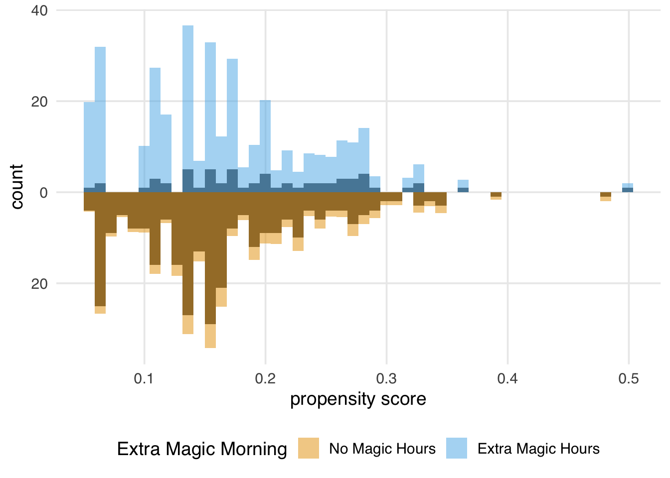
We can learn a few things from Figure 10.3. First, we can see that there are more “unexposed” days—days without extra magic hours in the morning—compared to “exposed” in the observed population. We can see this by examining the darker histograms, which show the distributions in the observed sample. Similarly, the exposed days are upweighted more substantially, as evidenced by the light blue we see on the top. We can also see that after weighting, the two distributions look similar; the shape of the blue weighted distribution on top looks comparable to the orange weighted distribution below.
10.2.2 Average treatment effect among the treated
The target population to estimate the average treatment effect among the treated (ATT) is the exposed (treated) population. This causal estimand conditions on those in the exposed group:
\[E[Y(1) - Y(0) | X = 1]\]
Example research questions where the ATT is of interest could include “Should we stop our marketing campaign to those currently receiving it?” or “Should medical providers stop recommending treatment for those currently receiving it?” (Greifer and Stuart 2021)
The ATT is a common target estimand when using matching; here, all exposed observations are included and “matched” to control observations, some of which may be discarded. Alternatively, the ATT can be estimated via weighting. The ATT weight is estimated by:
\[w_{ATT} = X + \frac{(1 - X)p}{1 - p}\]
Let’s add the ATT weights to the seven_dwarfs_wts data frame and look at their distribution.
seven_dwarfs_wts <- seven_dwarfs_wts |>
  mutate(w_att = wt_att(.fitted, park_extra_magic_morning))

ggplot(seven_dwarfs_wts, aes(w_att)) +
  geom_histogram(bins = 50)
Compared to the ATE weights, the weights in Figure 10.4 look more stable; the distribution of the weights is not heavily skewed, and the range is small, from ground zero to a bit over one, with many at precisely one. These weights are exactly one for all days in the exposed group. Theoretically, for unexposed days these weights can range from zero to infinity. Still, because we have many more unexposed days compared to exposed in this particular sample, the range is much smaller, meaning the vast majority of unexposed days are “down-weighted” to match the variable distribution of the exposed days. Let’s take a look at the weighted table to see this a bit more clearly.
seven_dwarfs_svy <- svydesign(
  ids = ~1,
  data = seven_dwarfs_wts,
  weights = ~w_att
)
tbl_svysummary(
  seven_dwarfs_svy,
  by = park_extra_magic_morning,
  include = c(park_ticket_season, park_close, park_temperature_high)
) |>
add_overall(last = TRUE)| Characteristic |
No Magic Hours N = 601 |
Extra Magic Hours N = 601 |
Overall N = 1201 |
|---|---|---|---|
| Ticket Season | |||
| peak | 18 (30%) | 18 (30%) | 36 (30%) |
| regular | 35 (58%) | 35 (58%) | 70 (58%) |
| value | 7 (12%) | 7 (12%) | 14 (12%) |
| Close Time | |||
| 16:30:00 | 1 (0.9%) | 0 (0%) | 1 (0.4%) |
| 18:00:00 | 13 (21%) | 18 (30%) | 31 (26%) |
| 20:00:00 | 2 (3.3%) | 2 (3.3%) | 4 (3.3%) |
| 21:00:00 | 3 (4.6%) | 0 (0%) | 3 (2.3%) |
| 22:00:00 | 17 (28%) | 11 (18%) | 28 (23%) |
| 23:00:00 | 17 (28%) | 11 (18%) | 28 (23%) |
| 24:00:00 | 8 (14%) | 17 (28%) | 25 (21%) |
| 25:00:00 | 0 (0.3%) | 1 (1.7%) | 1 (1.0%) |
| Historic High Temperature | 83 (74, 88) | 83 (75, 87) | 83 (75, 88) |
| 1 n (%); Median (Q1, Q3) | |||
We again achieve a balance between groups, but the target values in Table 10.3 differ from the previous tables. Recall in our ATE weighted table (Table 10.2), when looking at the wdw_ticket_season variable, we saw the weighted percent in the peak season balanced close to 22%, the overall percent of peak days in the observed sample. We again see balance, but the weighted percent of peak season days is 30% in the exposed and unexposed groups, reflecting the percent in the unweighted exposure group. If you compare Table 10.3 to our unweighted table (Table 10.1), you might notice that the columns are most similar to the exposed column from the unweighted table. This is because the “target” population is the exposed group, the days with extra magic hours in the morning, so we’re trying to make the comparison group (no magic hours) as similar to that group as possible.
We can again create a mirrored histogram to observe the weighted psuedopopulation.
ggplot(seven_dwarfs_wts, aes(.fitted, group = park_extra_magic_morning)) +
  geom_mirror_histogram(bins = 50) +
  geom_mirror_histogram(
    aes(fill = park_extra_magic_morning, weight = w_att),
    bins = 50,
    alpha = 0.5
  ) +
  scale_y_continuous(labels = abs) +
  labs(
    x = "propensity score",
    fill = "Extra Magic Morning"
  )
Since every day in the exposed group has a weight of 1, the distribution of the propensity scores (the dark bars above 0 on the graph) in Figure 10.5 overlaps exactly with the weighted distribution overlaid in blue. In the unexposed population, we see that almost all observations are down weighted; the dark orange distribution is smaller than the distribution of the propensity scores and more closely matches the exposed distribution above it. The ATT is easier to estimate when there are many more observations in the unexposed group compared to the exposed one.
10.2.3 Average treatment effect among the unexposed
The target population to estimate the average treatment effect among the unexposed (control) (ATU / ATC) is the unexposed (control) population. This causal estimand conditions on those in the unexposed group.
\[E[Y(1) - Y(0) | X = 0]\]
Example research questions where the ATU is of interest could include “Should we send our marketing campaign to those not currently receiving it?” or “Should medical providers begin recommending treatment for those not currently receiving it?” (Greifer and Stuart 2021)
The ATU can be estimated via matching; here, all unexposed observations are included and “matched” to exposed observations, some of which may be discarded. Alternatively, the ATU can be estimated via weighting. The ATU weight is estimated by:
\[w_{ATU} = \frac{X(1-p)}{p}+ (1-X)\] Let’s add the ATU weights to the seven_dwarfs_wts data frame and look at their distribution.
seven_dwarfs_wts <- seven_dwarfs_wts |>
  mutate(w_atu = wt_atu(.fitted, park_extra_magic_morning))

ggplot(seven_dwarfs_wts, aes(w_atu)) +
  geom_histogram(bins = 50)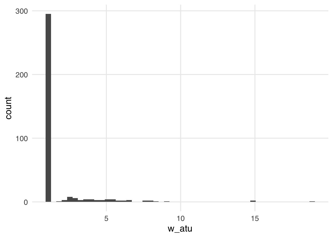
The distribution of the weights in Figure 10.6 weights looks very similar to what we saw with the ATE weights—several around 1, with a long tail. These weights will be 1 for all observations in the unexposed group; they can range from 0 to infinity for the exposed group. Because we have more observations in our unexposed group, our exposed observations are upweighted to match their distribution.
Now let’s take a look at the weighted table.
seven_dwarfs_svy <- svydesign(
  ids = ~1,
  data = seven_dwarfs_wts,
  weights = ~w_atu
)
tbl_svysummary(
  seven_dwarfs_svy,
  by = park_extra_magic_morning,
  include = c(park_ticket_season, park_close, park_temperature_high)
) |>
add_overall(last = TRUE)| Characteristic |
No Magic Hours N = 2941 |
Extra Magic Hours N = 2971 |
Overall N = 5911 |
|---|---|---|---|
| Ticket Season | |||
| peak | 60 (20%) | 63 (21%) | 123 (21%) |
| regular | 158 (54%) | 152 (51%) | 310 (52%) |
| value | 76 (26%) | 82 (27%) | 158 (27%) |
| Close Time | |||
| 16:30:00 | 1 (0.3%) | 0 (0%) | 1 (0.2%) |
| 18:00:00 | 37 (13%) | 54 (18%) | 91 (15%) |
| 20:00:00 | 18 (6.1%) | 17 (5.7%) | 35 (5.9%) |
| 21:00:00 | 28 (9.5%) | 0 (0%) | 28 (4.7%) |
| 22:00:00 | 91 (31%) | 75 (25%) | 166 (28%) |
| 23:00:00 | 78 (27%) | 70 (23%) | 148 (25%) |
| 24:00:00 | 40 (14%) | 77 (26%) | 117 (20%) |
| 25:00:00 | 1 (0.3%) | 5 (1.6%) | 6 (1.0%) |
| Historic High Temperature | 84 (78, 89) | 83 (78, 87) | 84 (78, 88) |
| 1 n (%); Median (Q1, Q3) | |||
Now the exposed column of Table 10.4 is weighted to match the unexposed column of the unweighted table.
We can again create a mirrored histogram to observe the weighted psuedopopulation.
ggplot(seven_dwarfs_wts, aes(.fitted, group = park_extra_magic_morning)) +
  geom_mirror_histogram(bins = 50) +
  geom_mirror_histogram(
    aes(fill = park_extra_magic_morning, weight = w_atu),
    bins = 50,
    alpha = 0.5
  ) +
  scale_y_continuous(labels = abs) +
  labs(
    x = "propensity score",
    fill = "Extra Magic Morning"
  )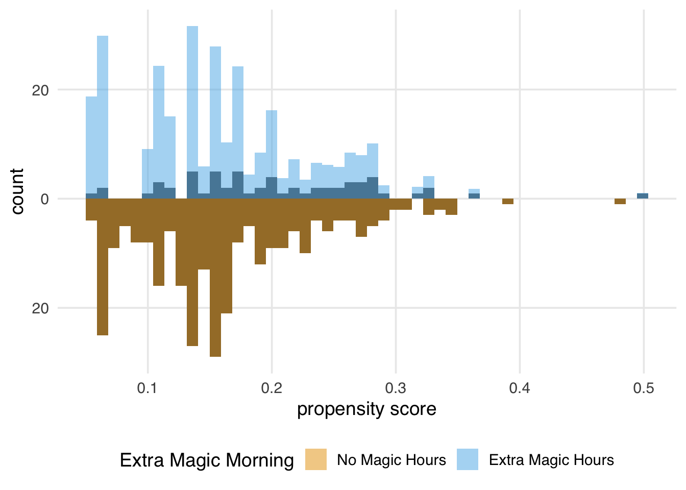
The weights for the unexposed days are all 1, so the distribution of the propensity scores for this group exactly overlaps the weighted pseudopopulation in orange. The blue bars indicate that the exposed population is largely upweighted to match the unexposed distribution.
10.2.4 Average treatment effect among the evenly matchable
The target population to estimate the average treatment effect among the evenly matchable (ATM) is the evenly matchable. This causal estimand conditions on those deemed “evenly matchable” by some distance metric.
\[E[Y(1) - Y(0) | M_d = 1]\]
Here \(d\) denotes a distance measure, and \(M_d=1\) indicates that a unit is evenly matchable under that distance measure.(Samuels 2017; D’Agostino McGowan 2018) Example research questions where the ATM is of interest could include “Should those at clinical equipoise receive the exposure?” (Greifer and Stuart 2021)
The ATM is a common target estimand when using matching. Here, some exposed observations are “matched” to control observations, however some observations in both groups may be discarded. This is often done via a “caliper”, where observations are only matched if they fall within a pre-specified caliper distance of each other. Alternatively, the ATM can be estimated via weighting. The ATM weight is estimated by:
\[w_{ATM} = \frac{\min \{p, 1-p\}}{Xp + (1-X)(1-p)}\]
Let’s add the ATM weights to the seven_dwarfs_wts data frame and look at their distribution.
seven_dwarfs_wts <- seven_dwarfs_wts |>
  mutate(w_atm = wt_atm(.fitted, park_extra_magic_morning))

ggplot(seven_dwarfs_wts, aes(w_atm)) +
  geom_histogram(bins = 50)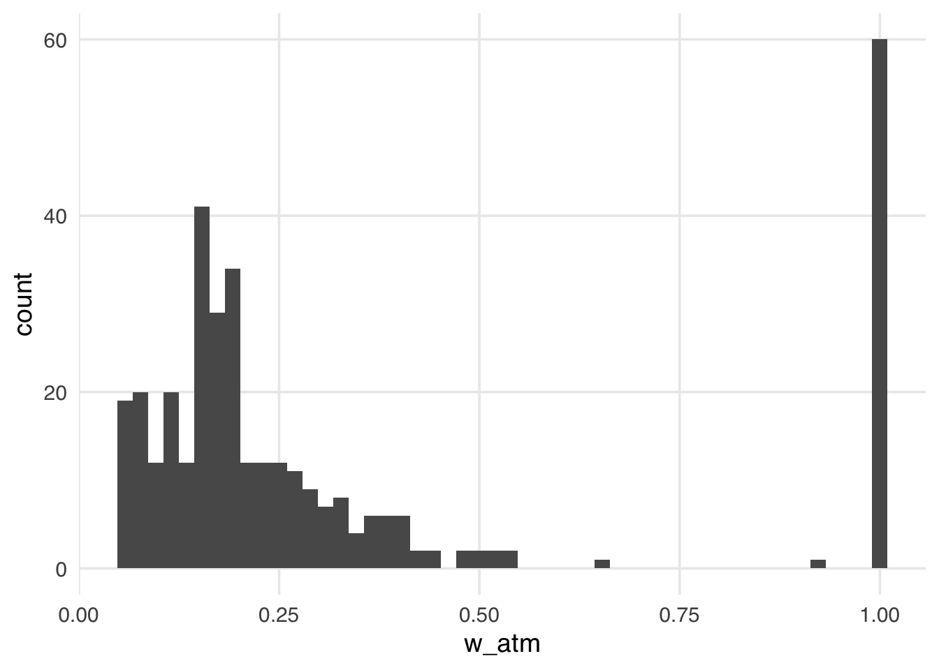
The distribution of the weights in Figure 10.8 looks very similar to what we saw with the ATT weights. That is because, in this particular sample, there are many more unexposed observations compared to exposed ones. These weights have the nice property that they range from 0 to 1, making them always stable, regardless of the imbalance between exposure groups.
Now let’s take a look at the weighted table.
seven_dwarfs_svy <- svydesign(
  ids = ~1,
  data = seven_dwarfs_wts,
  weights = ~w_atm
)
tbl_svysummary(
  seven_dwarfs_svy,
  by = park_extra_magic_morning,
  include = c(park_ticket_season, park_close, park_temperature_high)
) |>
add_overall(last = TRUE)| Characteristic |
No Magic Hours N = 601 |
Extra Magic Hours N = 601 |
Overall N = 1201 |
|---|---|---|---|
| Ticket Season | |||
| peak | 18 (30%) | 18 (30%) | 36 (30%) |
| regular | 35 (58%) | 35 (58%) | 70 (58%) |
| value | 7 (12%) | 7 (12%) | 14 (12%) |
| Close Time | |||
| 16:30:00 | 1 (0.9%) | 0 (0%) | 1 (0.4%) |
| 18:00:00 | 13 (21%) | 18 (30%) | 31 (26%) |
| 20:00:00 | 2 (3.3%) | 2 (3.3%) | 4 (3.3%) |
| 21:00:00 | 3 (4.6%) | 0 (0%) | 3 (2.3%) |
| 22:00:00 | 17 (28%) | 11 (18%) | 28 (23%) |
| 23:00:00 | 17 (28%) | 11 (18%) | 28 (23%) |
| 24:00:00 | 8 (14%) | 17 (28%) | 25 (21%) |
| 25:00:00 | 0 (0.3%) | 1 (1.7%) | 1 (1.0%) |
| Historic High Temperature | 83 (74, 88) | 83 (75, 87) | 83 (75, 88) |
| 1 n (%); Median (Q1, Q3) | |||
In this particular sample, the ATM weights resemble the ATT weights, so this table looks similar to the ATT weighted table. This similarity is not guaranteed, and the ATM pseudopopulation can look different from the overall, exposed, and unexposed unweighted populations. It’s thus essential to examine the weighted table when using ATM weights to understand what population inference will ultimately be drawn on.
We can again create a mirrored histogram to observe the ATM weighted psuedopopulation.
ggplot(seven_dwarfs_wts, aes(.fitted, group = park_extra_magic_morning)) +
  geom_mirror_histogram(bins = 50) +
  geom_mirror_histogram(
    aes(fill = park_extra_magic_morning, weight = w_atm),
    bins = 50,
    alpha = 0.5
  ) +
  scale_y_continuous(labels = abs) +
  labs(
    x = "propensity score",
    fill = "Extra Magic Morning"
  )
Again, the ATM weights are bounded by 0 and 1, meaning that all observations will be down weighted. This removes the potential for finite sample bias due to large weights in small samples and has improved variance properties.
10.2.5 Average treatment effect among the overlap population
The target population to estimate the average treatment effect among the overlap population (ATO) is the overlap – this is very similar to the “even matchable” from above. Example research questions where the ATO is of interest are the same as those for the ATM, such as “Should those at clinical equipoise receive the exposure?” (Greifer and Stuart 2021)
These weights, again, are pretty similar to the ATM weights but are slightly attenuated, yielding improved variance properties.
The ATO weight is estimated by:
\[w_{ATO} = X(1-p) + (1-X)p\]
Let’s add the ATO weights to the seven_dwarfs_wts data frame and look at their distribution.
seven_dwarfs_wts <- seven_dwarfs_wts |>
  mutate(w_ato = wt_ato(.fitted, park_extra_magic_morning))

ggplot(seven_dwarfs_wts, aes(w_ato)) +
  geom_histogram(bins = 50)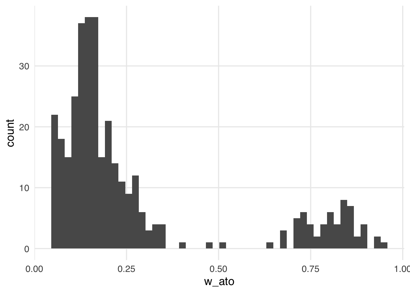
Like the ATM weights, the ATO weights are bounded by 0 and 1, making them more stable than the ATE, ATT, and ATU, regardless of the exposed and unexposed imbalance.
Let’s revisit our finite sample bias simulation, adding in the ATO weights to examine whether they are impacted by this potential for bias.
sim <- function(n) {
  ## create a simulated dataset
  finite_sample <- tibble(
    z = rnorm(n),
    x = case_when(
      0.5 + z + rnorm(n) > 0 ~ 1,
      TRUE ~ 0
    ),
    y = z + rnorm(n)
  )
  finite_sample_wts <- glm(
    x ~ z,
    data = finite_sample,
    family = binomial("probit")
  ) |>
    augment(data = finite_sample, type.predict = "response") |>
    mutate(
      wts_ate = wt_ate(.fitted, x),
      wts_ato = wt_ato(.fitted, x)
    )
  bias <- finite_sample_wts |>
    summarize(
      effect_ate = sum(y * x * wts_ate) / sum(x * wts_ate) -
        sum(y * (1 - x) * wts_ate) / sum((1 - x) * wts_ate),
      effect_ato = sum(y * x * wts_ato) / sum(x * wts_ato) -
        sum(y * (1 - x) * wts_ato) / sum((1 - x) * wts_ato)
    )
  tibble(
    n = n,
    bias = c(bias$effect_ate, bias$effect_ato),
    weight = c("ATE", "ATO")
  )
}

## Examine 5 different sample sizes, simulate each 1000 times
set.seed(1)
finite_sample_sims <- map_df(
  rep(
    c(50, 100, 500, 1000, 5000, 10000),
    each = 1000
  ),
  sim
)

bias <- finite_sample_sims |>
  group_by(n, weight) |>
  summarize(bias = mean(bias))
Let’s plot our results:
ggplot(bias, aes(x = n, y = bias, color = weight)) +
  geom_point() +
  geom_line() +
  geom_hline(yintercept = 0, lty = 2)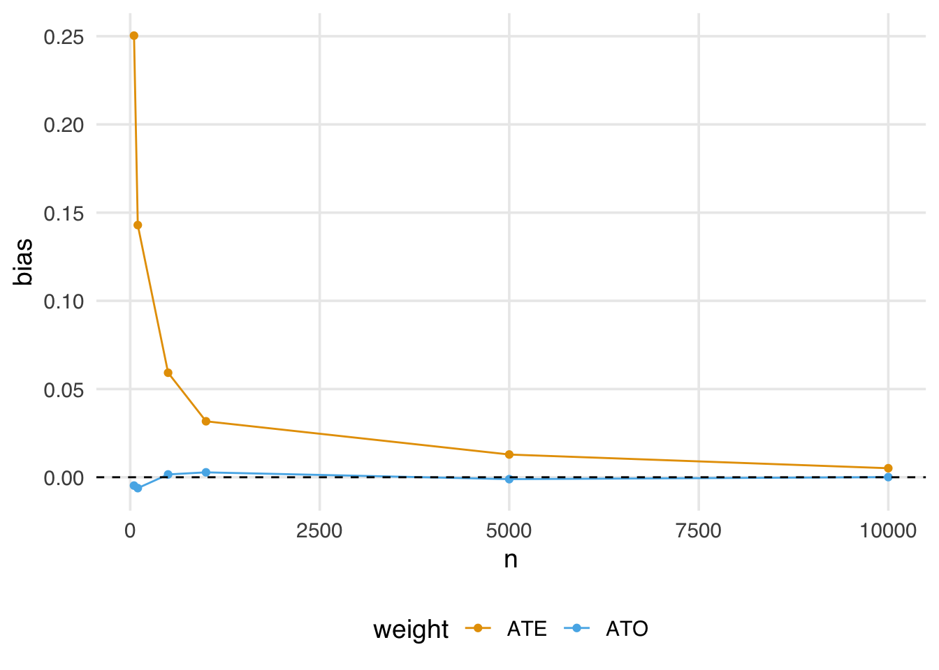
Notice here the estimate using the ATO weights is almost immediately unbiased, even in fairly small samples.
Now let’s take a look at the weighted table.
seven_dwarfs_svy <- svydesign(
  ids = ~1,
  data = seven_dwarfs_wts,
  weights = ~w_ato
)
tbl_svysummary(
  seven_dwarfs_svy,
  by = park_extra_magic_morning,
  include = c(park_ticket_season, park_close, park_temperature_high)
) |>
add_overall(last = TRUE)| Characteristic |
No Magic Hours N = 481 |
Extra Magic Hours N = 481 |
Overall N = 961 |
|---|---|---|---|
| Ticket Season | |||
| peak | 14 (29%) | 14 (29%) | 28 (29%) |
| regular | 28 (58%) | 28 (58%) | 55 (58%) |
| value | 6 (13%) | 6 (13%) | 13 (13%) |
| Close Time | |||
| 16:30:00 | 0 (0.7%) | 0 (0%) | 0 (0.4%) |
| 18:00:00 | 9 (19%) | 13 (27%) | 22 (23%) |
| 20:00:00 | 2 (3.7%) | 2 (3.7%) | 4 (3.7%) |
| 21:00:00 | 2 (5.1%) | 0 (0%) | 2 (2.5%) |
| 22:00:00 | 14 (29%) | 9 (20%) | 23 (24%) |
| 23:00:00 | 14 (28%) | 9 (19%) | 23 (24%) |
| 24:00:00 | 7 (14%) | 14 (29%) | 21 (22%) |
| 25:00:00 | 0 (0.3%) | 1 (1.7%) | 1 (1.0%) |
| Historic High Temperature | 83 (75, 88) | 83 (76, 87) | 83 (75, 88) |
| 1 n (%); Median (Q1, Q3) | |||
Like the ATM weights, the ATO pseudopopulation may not resemble the overall, exposed, or unexposed unweighted populations, so it is essential to examine these weighted tables to understand the population on whom we will draw inferences.
We can again create a mirrored histogram to observe the ATO weighted psuedopopulation.
ggplot(seven_dwarfs_wts, aes(.fitted, group = park_extra_magic_morning)) +
  geom_mirror_histogram(bins = 50) +
  geom_mirror_histogram(
    aes(fill = park_extra_magic_morning, weight = w_ato),
    bins = 50,
    alpha = 0.5
  ) +
  scale_y_continuous(labels = abs) +
  labs(
    x = "propensity score",
    fill = "Extra Magic Morning"
  )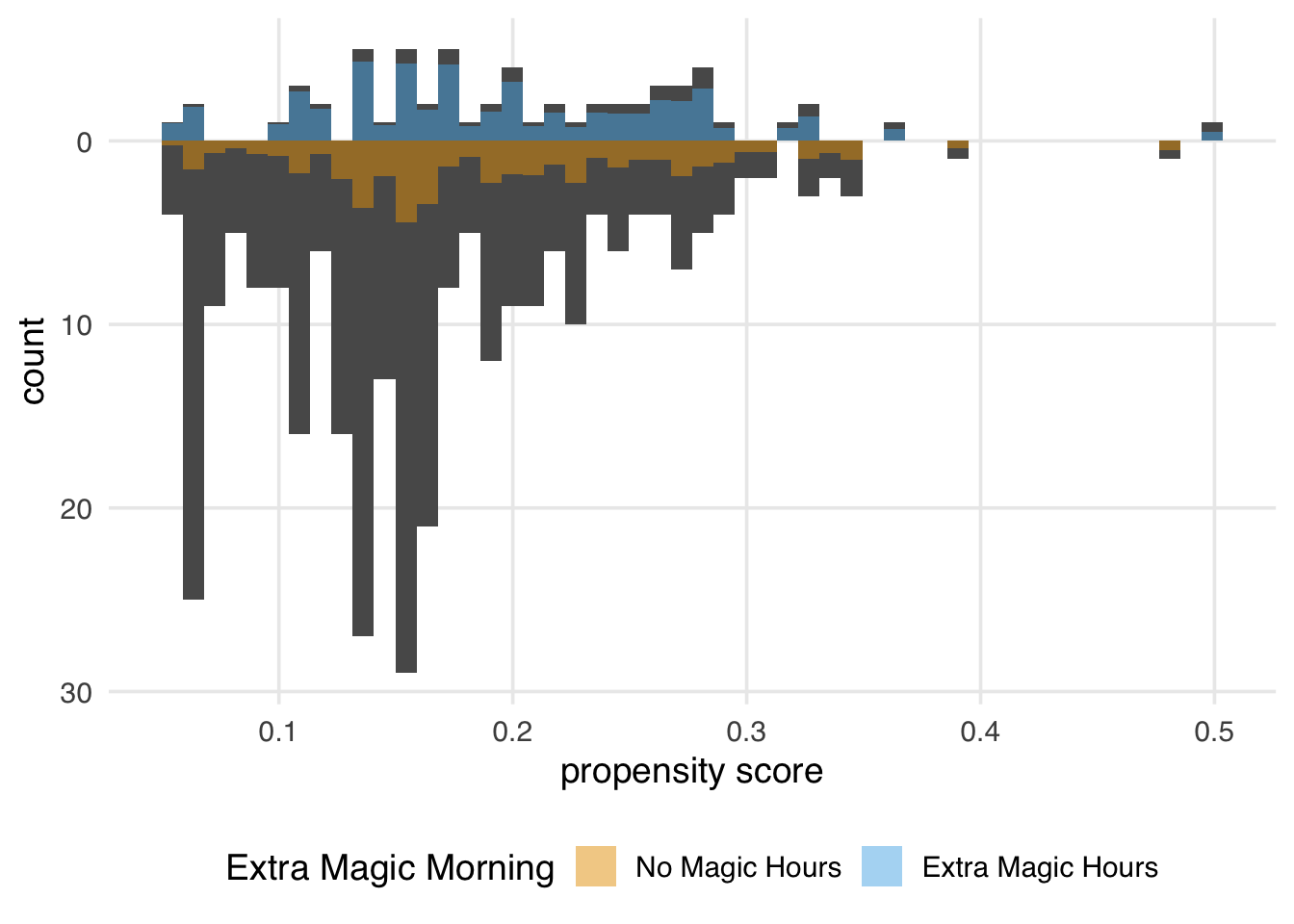
Figure 10.12 looks similar to the ATM pseudopopulation, with slight attenuation, as evidenced by the increased down weighting in the exposed population. We prefer using the ATO weights when the overlap (or evenly matchable) population is the target, as they have improved variance properties. Another benefit is that any variables included in the propensity score model (if fit via logistic regression) will be perfectly balanced on the mean. We will discuss this further in Chapter 9.
10.3 Choosing estimands
Several factors need to be considered when choosing an estimand for a given analysis. First an foremost, the research question at hand will drive this decision. For example, returing to the Touring Plans data, suppose Disney was interested in assessing whether they should add additional extra magic hours on days that don’t currently have them—here, the ATU will be the estimand of interest. Other considerations include the available sample size and the distribution of the exposed and unexposed observations (i.e. might finite sample bias be an issue?). Below is a table summarizing the estimands and methods for estimating them (including R functions and example code), along with sample questions extended from Table 2 in Greifer and Stuart (2021).
| Estimand | Target population | Example Research Question | Matching Method | Weighting Method |
|---|---|---|---|---|
| ATE | Full population |
Should we decide whether to have extra magic hours all mornings to change the wait time for Seven Dwarfs Mine Train between 5-6pm? Should a specific policy be applied to all eligible observations? |
Full matching Fine stratification
|
ATE Weights |
| ATT | Exposed (treated) observations |
Should we stop extra magic hours to change the wait time for Seven Dwarfs Mine Train between 5-6pm? Should we stop our marketing campaign to those currently receiving it? Should medical providers stop recommending treatment for those currently receiving it? |
Pair matching without a caliper Full matching Fine stratification
|
ATT weights |
| ATU | Unexposed (control) observations |
Should we add extra magic hours for all days to change the wait time for Seven Dwarfs Mine Train between 5-6pm? Should we extend our marketing campaign to those not receiving it? Should medical providers extend treatment to those not currently receiving it? |
Pair matching without a caliper Full matching Fine stratification
|
ATU weights |
| ATM | Evenly matchable |
Are there some days we should change whether we are offering extra magic hours in order to change the wait time for Seven Dwarfs Mine Train between 5-6pm? Is there an effect of the exposure for some observations? Should those at clinical equipoise receive treatment? |
Caliper matching
Coarsened exact matching Cardinality matching
|
ATM weights |
| ATO | Overlap population | Same as ATM |
ATO weights |
10.4 Risk ratio, risk difference, and odds ratio
In the example we’ve taken up, the outcome, posted wait times, is continuous. Using linear regression, the ATE and friends are calculated as a difference in means. A difference in means is a valuable effect to estimate, but it’s not the only one. Let’s say we use ATT weights and weight an outcome regression to calculate the relative change in posted wait time. The relative change is still a treatment effect among the treated, but it’s on a relative scale. The important part is that the weights allow us to average over the covariates of the treated for whichever specific estimand we’re trying to estimate. Sometimes, when people say something like “the average treatment effect”, they are talking about a difference in mean outcomes among the whole sample, so it’s good to be specific.
We have three standard options for binary outcomes: the risk ratio, risk difference, and odds ratio. In the case of a binary outcome, we calculate average probabilities for each treatment group. Let’s call these p_untreated and p_treated. When we’re working with these probabilities, calculating the risk difference and risk ratio is simple:
-
Risk difference:
p_treated - p_untreated -
Risk ratio:
p_treated / p_untreated
By “risk”, we mean the risk of an outcome. That assumes the outcome is negative, like developing a disease. Sometimes, you’ll hear these described as the “response ratio” or “response difference”. A more general way to think about these is as the difference in or ratio of the probabilities of the outcome.
The odds for a probability is calculated as p / (1 - p), so the odds ratio is:
-
Odds ratio:
(p_treated / (1 - p_treated)) / (p_untreated / (1 - p_untreated))
When outcomes are rare, (1 - p) approaches 1, and odds ratios approximate risk ratios. The rarer the outcome, the closer the approximation.
One feature of the logistic regression model is that the coefficients are log-odds ratios, so exponentiating them produces odds ratios. However, when using logistic regression, you can also work with predicted probabilities to calculate risk differences and ratios, as we’ll see in Chapter 13.
Just like with continuous outcomes, we can target each of these estimands for a different subset of the population, e.g., the risk ratio among the untreated, the odds ratio among the evenly matchable, and so on.
These options also extend to categorical outcomes. There are different ways of organizing them depending on the nature of the categorical variables. An effect that’s commonly estimated for non-ordinal categorical variables is a series of odds ratios with one level of the outcome serving as the reference level (e.g., an OR for 1 vs. 2 and 1 vs. 3 and so on). Multinomial regression models, such as nnet::multinom(), can produce these log-odds ratios as coefficients, an extension of logistic regression. For ordinal outcomes, ordinal logistic regression like MASS::polr() calculates a series of log-odds ratios that compare each previous value of the outcome. Like logistic regression, you are not limited to odds ratios with these extensions, as you can work with the predicted probabilities of each category to calculate the effect you’re interested in.
Case-control studies are a typical design in epidemiology where participants are sampled by outcome status Schlesselman (1982). Cases with the outcome are contacted, and controls are sampled from the population from which the cases come. These types of studies are used when outcomes are rare. They can also be faster and cheaper than studies that follow people from the time of exposure.
Because of how sampling happens in case-control studies, you don’t have baseline risk because you don’t have all the individuals who did not have the outcome. Interestingly, you can still recover the odds ratio. When outcomes are rare, odds ratios approximate risk ratios. You cannot, however, calculate the risk difference.
10.4.1 Absolute and relative measures
Absolute measures, such as risk differences, and relative measures, such as the risk and odds ratios, offer different perspectives on the treatment effect. Depending on the baseline probability of the outcome, absolute and relative measures might lead you to different conclusions.
Consider a rare outcome with a baseline probability of 0.0001, a rate of 1 event per 10,000 observations. That’s the probability for the unexposed. Let’s say the exposed have a probability of the outcome of 0.0008. That’s 8 times greater than the unexposed, a substantial relative effect. But it’s only 0.0007 on the absolute scale.
Now, consider a more common outcome with a baseline probability of 0.20. The exposed group has a probability of the outcome of 0.40. Now, the relative risk is 2, while the risk difference is 0.20. Although the relative effect is much smaller, it creates more outcome events because the outcome is more prevalent.
The effect of smoking on health is an excellent example of this. As we know, smoking drastically increases the relative risk of lung cancer. But lung cancer is a pretty rare disease. Smoking also increases the risk of heart disease, although the relative effect is not nearly as high as lung cancer. However, heart disease is much more prevalent. More people die of smoking-related heart disease than they do of lung cancer because of the absolute change in risk. Both the absolute and relative perspectives are valid.
Another perspective on the difference in probabilities is the number needed to treat (NNT) measure. It’s simply the inverse of the risk difference, and it represents the number of exposed individuals needed to prevent or create one outcome.
Consider a product for sale with a baseline purchase probability of 5%, which means that 5 in 100 people will buy this product. A marketing team creates an ad, and those who see the ad have a probability of 7% to buy the product. The absolute difference in probabilities of buying the product is 0.02, and so 1 / 0.02 = 50 people need to see the ad to increase the number of purchases by one.
The NNT is an imperfect measure because of its simplicity, but it offers another perspective on what the treatment effect actually means in practice.
10.4.2 Non-collapsibility
Odds ratios are convenient because of their connection to logistic regression. They also have a peculiar quality: they are non-collapsible. Non-collapsibility means that, when you compare odds ratios in the whole sample (marginal) versus among subgroups (conditional), the marginal odds ratio is not a weighted average of the conditional odds ratio (Didelez and Stensrud 2021; Greenland 2021a, 2021b). This is not a property that, for instance, the risk ratio has. Let’s look at an example.
Say we have an outcome, an exposure, and a covariate. exposure causes outcome, as does covariate1. But covariate does not cause exposure; it’s not a confounder. In other words, the effect estimate of exposure on outcome should be the same whether or not we account for covariate.
Code
library(ggdag)
dagify(
  outcome ~ exposure + covariate,
  coords = time_ordered_coords()
) |>
  ggdag(use_text = FALSE) +
  geom_dag_text_repel(aes(label = name), box.padding = 1.8, direction = "x") +
  theme_dag()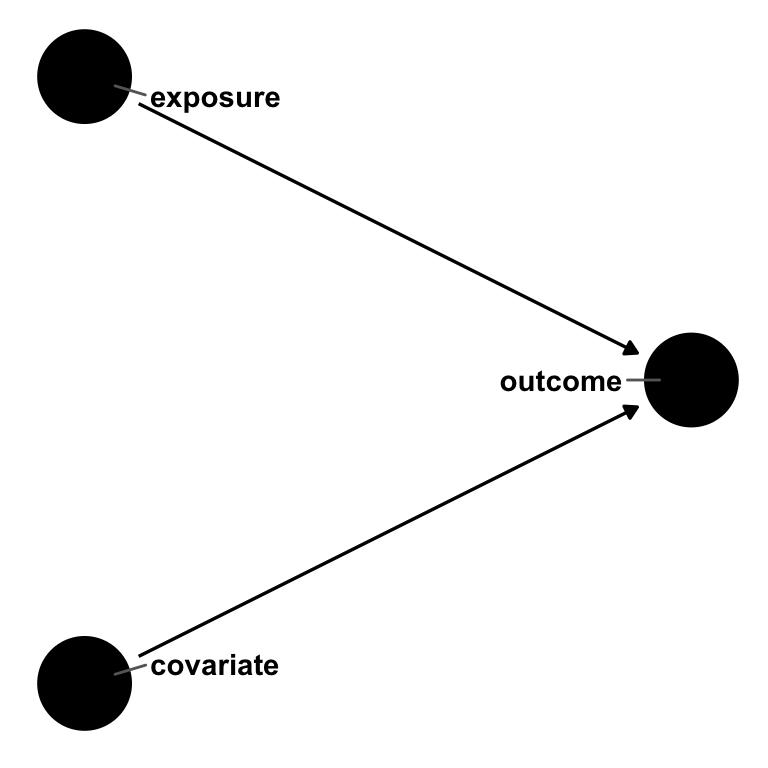
outcome, exposure, and covariate. exposure and covariate both cause outcome, but there is no relationship between exposure and covariate. In a logistic regression, the odds ratio for exposure will be non-collapsible over strata of covariate.Let’s simulate this.
First, let’s look at the relationship between exposure and outcome among everyone.
table(exposure, outcome) outcome
exposure 0 1
0 2036 3021
1 1115 3828We can calculate the odds ratio using this frequency table: ((3828 * 2036) / (3021 * 1115)) = 2.31.
This odds ratio is the same result we get with logistic regression when we exponentiate the results.
# A tibble: 2 × 5
  term        estimate std.error statistic  p.value
  <chr>          <dbl>     <dbl>     <dbl>    <dbl>
1 (Intercept)     1.48    0.0287      13.8 4.33e-43
2 exposure        2.31    0.0445      18.9 2.87e-79
This is a little off from the simulation model coefficient of exp(1). We get closer when we add in covariate.
# A tibble: 3 × 5
  term        estimate std.error statistic  p.value
  <chr>          <dbl>     <dbl>     <dbl>    <dbl>
1 (Intercept)    0.614    0.0378     -12.9 6.07e-38
2 exposure       2.78     0.0493      20.7 1.33e-95
3 covariate      7.39     0.0529      37.8 0
covariate is not a confounder, so by rights, it shouldn’t impact the effect estimate for exposure. Let’s look at the conditional odds ratios by covariate.
table(exposure, outcome, covariate), , covariate = 0
outcome
exposure 0 1
0 1572 986
1 951 1589
, , covariate = 1
outcome
exposure 0 1
0 464 2035
1 164 2239The odds ratio for those with covariate = 0 is 2.66. For those with covariate = 1, it’s 3.11. The marginal odds ratio, 2.31, is smaller than both of these!
The marginal risk ratio is 1.3. The risk ratio for those with covariate = 0 is 1.62. For those with covariate = 1, it’s 1.14. In this case, the marginal risk ratio is a weighted average collapsible over the strata of covariate (Huitfeldt, Stensrud, and Suzuki 2019).
It’s tempting to think you need to include covariate since the odds ratio changes when you add it in, and it’s closer to the model coefficient from the simulation. An important detail here is that non-collapsibility is not bias. Some authors describe it as omitted variable bias, but the marginal and conditional odds ratios are both correct because covariate is not a confounder. They are simply different estimands. The conditional odds ratio is the OR conditional on covariate. To meaningfully compare it to other odds ratios, those also need to be conditional on covariate. Non-collapsibility is a numerical property of odds; rather than creating bias, it creates a slightly more nuanced interpretation. The exact way non-collapsibility behaves also depends on whether the data-generating mechanism occurs on the additive or multiplicative scale; on the multiplicative scale (as in our simulation), removing a variable strongly related to the outcome changes the effect estimate, while on the additive scale, adding a variable strongly related to the outcome changes the effect, albeit on a smaller scale (Whitcomb and Naimi 2020). Instead of worrying about which version of the odds ratio is right, we recommend focusing on confounders, which are necessary for unbiased estimates, and predictors of the outcome, which are helpful for variance reduction.
Much ink has been spilled about the odds ratio versus the risk ratio and the relative versus absolute scale. We suggest that you present all three measures (the odds ratio, the risk ratio, and the risk difference) together with the baseline probability of the outcome. Each offers a different perspective on the causal effect. Be careful to interpret them with regard to the treatment group that you’ve included in your estimate. For example, the average risk difference calculated with ATT weights is the average risk difference among the treated.
The linear probability model is another common way to estimate treatment effects for binary outcomes. The linear probability model is standard in econometrics and other fields. It’s just OLS, although researchers often use a robust standard error because of heterogeneity in the variance of the residuals. The result is the risk difference, a collapsible measure.
lm(outcome ~ exposure)
Call:
lm(formula = outcome ~ exposure)

Coefficients:
(Intercept)     exposure
      0.597        0.177
The linear probability model is a handy way to model the relationship on the additive scale. However, it comes with a significant hiccup: logistic regression is bounded by 0 and 1, while OLS is not. That means that individual predictions may be less than 0 or more than 1, impossible values for probabilities.
We’ll see an alternative method for calculating risk differences with logistic regression in Chapter 13.
10.5 What estimand does multivariable linear regression target?
In Chapter 6, we discussed when standard methods like multivariable linear regression succeed and fail. But what estimand does a regression estimator like lm(outcome ~ exposure + confounder) estimate?
While exploring simple problems, you’ll notice that the answer you get from multivariable regression is often close to the answer you get for the ATE weights. If you had a distribution among the exposures where the treated or the untreated are disproportionately high, you might think it’s closer to the ATT or ATU.
The reality is that it’s not always clear which estimand we’re dealing with. One way to probe it is to use a technique to derive the implied weights from linear regression (Chattopadhyay and Zubizarreta 2022; Aronow and Samii 2015). The lmw package allows us to calculate these weights. The default is for the ATE, but we can also target other estimands.
These implied weights have some nice properties. They are perfectly balanced on the mean and have the lowest variance of such weights.
seven_dwarfs_with_ps |>
  mutate(park_close = as.numeric(park_close)) |>
  tidy_smd(
    .vars = c(park_ticket_season, park_close, park_temperature_high),
    .group = park_extra_magic_morning,
    .wts = iw
  ) |>
  ggplot(aes(abs(smd), variable, color = method, group = method)) +
  geom_love()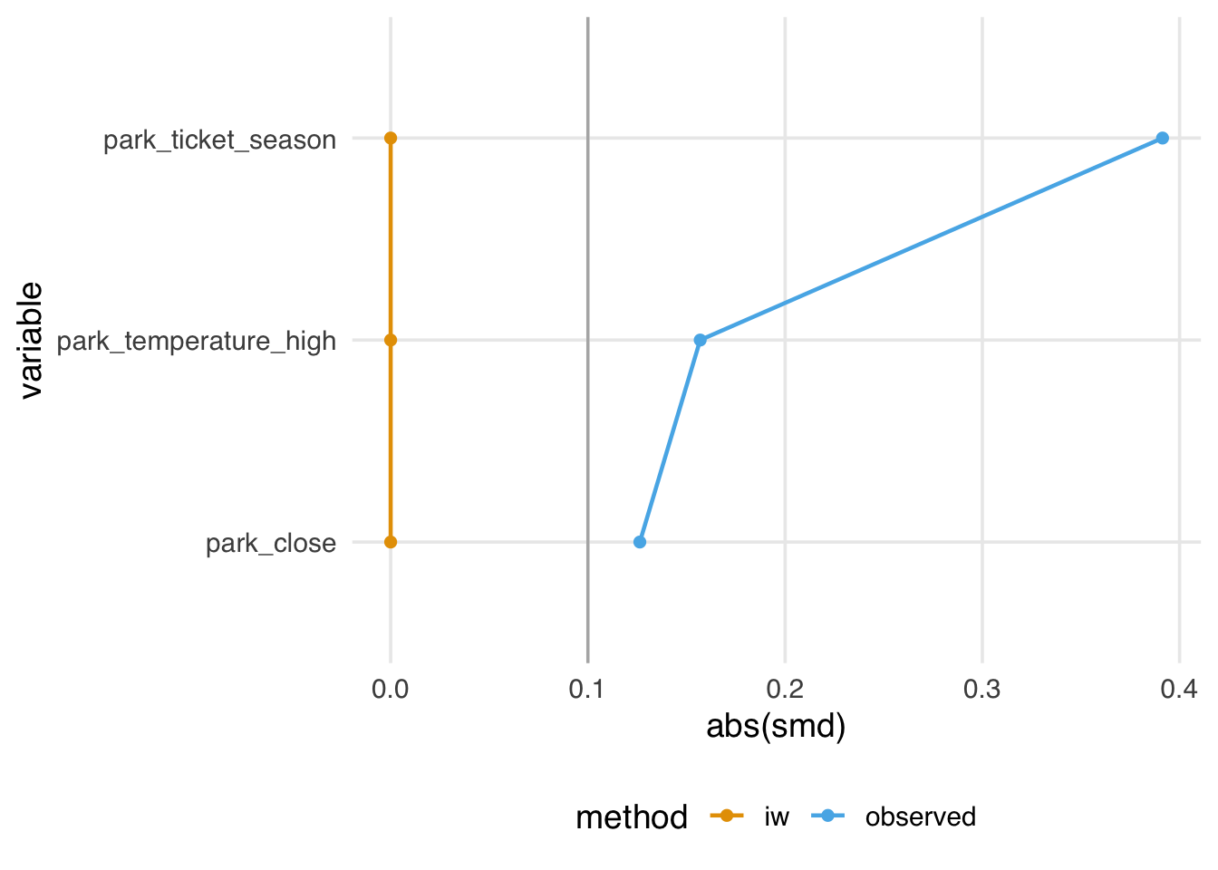
They also have a mean of 1, meaning they sum to the original size of the dataset.
# A tibble: 1 × 3
   mean   sum     n
  <dbl> <dbl> <int>
1     1  354.   354
The problem is that they also have some incoherent properties. Even though they balance on the mean, they may not create balance for the target population. Relatedly, they also sometimes generate negative weights. For instance, if we add interaction terms to this model, some weights are less than 0. Negative weights imply extrapolation beyond the joint distribution of the covariates in the data. Although they are close to 0 here, they can be more extreme. So, even though we’ve targeted the ATE, we may not have done so very precisely.
implied_weights_int <- lmw(
  ~ park_extra_magic_morning * (park_ticket_season + park_close + park_temperature_high),
  data = seven_dwarfs_with_ps,
  treat = "park_extra_magic_morning"
)

min(implied_weights_int$weights)
[1] -0.1113Suppose you feel OK about how these properties have played out for your problem. In that case, this approach offers an additional benefit: you can now use the techniques in this book to diagnose the balance and functional form of a multivariable linear model without peeking at the relationship between the outcome and the exposure. Since they are just weights, you can still use all the tools in halfmoon, gtsummary, and any other approach you like for working with weights. lmw even comes with a handy estimation function, lmw_est(), to calculate the effect on the outcome with a robust standard error. So, if your collaborators want to use OLS but you want to think critically about balance and extrapolation, you can have the best of both worlds. If you end up with negative weights and other strange properties, though, it might be better to use another approach, depending on your estimand.
We’ll discuss another way to use a multivariable outcome model like this to target different estimands in Chapter 13.
If there were no relationship between
exposureandoutcome, the relationship between the two would be null, and that would be collapsible regardless of the presence or absence ofcovariate.↩︎